How can you achieve an irresistible e-commerce search user experience that drives sales and boosts your business revenue?
Having run thousands of A/B tests, collaborating with businesses from a variety of industries, and reaching record e-commerce search-generated revenue months for our clients, we have crafted an ultimate 20-step guide to creating a better e-commerce search UX.
Getting into the core of user exploration: Prioritize the top search results
Here’s one most crucial takeaway from understanding user product exploration - users don’t always explore results sequentially. They often explore products in a ‘pinball’ pattern, bouncing their attention between various elements rather than following a linear path.
Understanding this user behavior will allow you to design search results that effectively capture and retain user attention.
How does that translate into numbers?
The top search result often garners around 30% of all clicks, while the top three search results account for about 60%.
Results near the top have a 10–20% chance of a click and a 40–80% chance of being seen.
Source: Amazon
#1. Focus relentlessly on the quality of the top three results for the top 100 queries. It ensures that the most common searches yield the most relevant outcomes.
#2. Display at least three search results without the need for scrolling to keep the most relevant options in immediate view.
Exploit scoped search: Let users specify their search
Scoped search allows users to limit their search to specific sections or types of content, enhancing relevance and speed.
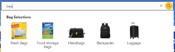
Source: Walmart
It’s especially useful on large websites with diverse catalogs, where it can prevent overwhelming users with irrelevant results.
Besides, it allows users to exploit product options they may have not thought of before.
#3. Make scoped options more visible and intuitive.
#4. Support visual search results representation to help users better grasp search results’ relevance.
Optimize the search box design: Let them notice the search bar
77% of online shoppers head straight to the search bar as soon as they land on the website.
The design and placement of the search box can influence users’ likelihood of using search as their primary product-finding strategy. Exploit it to drive more revenue.
#5. Never bury or hide the search box. The footer or menu bottom is not a suitable place.
#6. Don’t hide the search function behind an icon if you aim to encourage more searches. Replace an icon with an easy-to-spot search box. Make it prominent and easily accessible.

Source: Asos
#7. Ensure the search box width is greater than 60 characters on desktop and 45 characters on mobile for optimal usability.
Autocomplete: Your chance to proactively sell more
Autocomplete suggestions are a staple of modern e-commerce search interfaces, but their design can make or break the user experience.
A study by Baymard Institute found that only 19% of e-commerce sites get autocomplete design right.
The key best practices include:
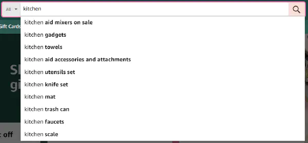
#8. Provide autosuggestions after the user types one letter. Your goal is to show search suggestions as soon as the search box can engage users immediately.
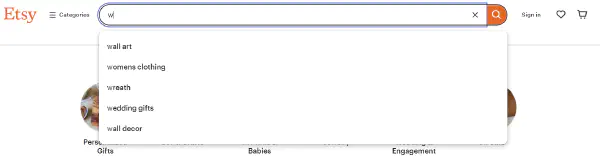
Source: Etsy
#9. Highlight the suggested query text to help users navigate the feature.
#10. Keep suggestions to less than 10 on desktop and 8 on mobile to avoid overwhelming users with too many options.
#11. Add relevant filters and scope suggestions in autocomplete to refine search results effectively.
Search result page: Area for conversion and exploration
The more satisfied the users with the search results page, the more likely their conversions.
To achieve a high level of user satisfaction, focus on search results relevance, speed, and intuitiveness. Here’s how you should do it:
#12. Display the user’s query at the top of the search results page to remind them of what they searched for.
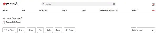
Source: Macy's
#13. Show the number of matching results to give users an idea of the breadth of their search.
#14. Implement breadcrumb navigation to help users keep track of their search journey across product categories.
#15. Highlight visited search results on the search results page to avoid mistakes.
#16. Design the results page with a clear visual hierarchy, making it easy for users to scan and find what they need.
Faceted Search: Let users redefine and narrow their search
Allow users to refine their search results by applying multiple filters based on the attributes of the items they’re searching for using criteria such as size, color, brand, price range, and other query-relevant features.
Not only does this facilitate large catalog navigation, but it also leads to a quicker purchase. Here’s how it’s done:
#17. Automatically choose the right facets for the query to provide the most relevant filtering options. Display different filters for beauty products and home renovation supplies.
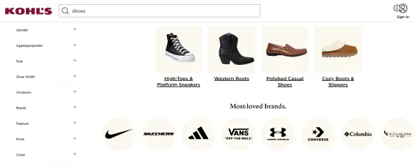
Source: Kohl's
#18. Display facets in an order that reflects user priorities and common search patterns.
#19. Implement dynamic filtering that updates the results in real-time as users select or deselect facets.
#20. Use consistent, industry-standard terminology across facets to avoid confusion and improve the search experience.
Implement these best practices and create a more intuitive and efficient search experience.
Ready to improve your customer satisfaction and boost conversion rates?
Request a free audit at LupaSearch, and our team will provide you with tips on how to better exploit your e-commerce search.
Already convinced? Request a free demo, and let’s reach for new records together.